Client work: Personal brand website
Problem
Most personal brand websites follow a familiar formula.
A large hero image.
A list of credentials.
Some logos.
A services section.
Testimonials.
A contact form.
There is nothing wrong with this structure. It works.
The problem is that it often produces websites that feel interchangeable.
If you replace the photograph and the logo, the experience remains largely the same.
For Bettina Kanninen, facilitator, trainer and interaction specialist, this felt particularly wrong.
Her value is not a workshop format.
It is not a keynote.
It is not even facilitation itself.
The real value lies in what happens when people meet, talk, listen, challenge each other and build something together.
The website needed to communicate that feeling.
The idea
Very early in the process one sentence started appearing everywhere.
Meaningful change happens in encounters.
That became the foundation for the entire project.
Instead of building a website around expertise, we started building one around a belief.
Instead of explaining what Bettina does, we focused on why she does it.
The result is less consultant website and more digital extension of a person.
A place where visitors can discover not only services and credentials but also thinking, values and personality.
Visual direction
The visual direction deliberately moves away from traditional corporate aesthetics.
No endless blue gradients.
No stock photography of people shaking hands.
No generic business imagery.
Instead, the concept draws inspiration from abstract oil paintings, editorial magazines and modern publishing platforms.
The visual ingredients include:
- vibrant oranges
- warm whites
- deep blacks
- flowing shapes
- layered forms
- expressive photography
- strong typography
The goal is to create energy without creating chaos.
Movement without distraction.
Personality without sacrificing clarity.
One recurring theme throughout the design is flow.
Ideas flow.
Conversations flow.
Change flows.
The visual language attempts to capture that movement through abstract forms, overlapping shapes and organic compositions.
Information architecture
The site is intentionally simple.
Rather than creating dozens of destinations, the structure focuses on a few strong content experiences.
Home
The homepage introduces Bettina's philosophy, work and expertise.
It answers the question:
Why should I care?
Not through credentials but through ideas.
Thoughts
One of the most important parts of the project.
Rather than separating blog posts and social media content, both live in the same ecosystem.
This reflects reality.
Most contemporary experts publish significantly more frequently on LinkedIn than on their own websites.
Instead of pretending otherwise, the design embraces it.
Approximately:
- 80% LinkedIn content
- 20% long-form articles
Both appear within the same browsing experience.
The result feels less like a blog archive and more like an active stream of thinking.
Human behind the work
This became one of the strongest concepts during exploration.
Most professional websites focus heavily on expertise.
Very few focus on the person.
The human behind the work section introduces curiosity, personality, inspiration and everyday moments.
Not because visitors need to know everything.
Because people connect with people.
The section acts as a bridge between professional credibility and human connection.
Events
A dedicated space for speaking engagements, workshops and facilitation work.
Media
A curated archive of interviews, podcasts and appearances.
Importantly, this section sits lower in the hierarchy.
Media validates credibility.
It should not replace personality.
Content strategy
One interesting challenge involved publishing.
Historically, websites and social media have existed as separate worlds.
This project treats them as one.
LinkedIn posts are not hidden away behind external links.
They become part of the overall content experience.
Articles provide depth.
LinkedIn provides frequency.
Together they create a living platform rather than a static website.
The goal is not to build a blog.
The goal is to build a thought stream.
Technical architecture
The website will be built as a fully custom WordPress implementation.
No page builders.
No purchased themes.
No unnecessary complexity.
The planned architecture includes:
- custom WordPress theme
- Advanced Custom Fields Pro
- custom post types
- reusable content blocks
- responsive design system
- editorial content management
Content types currently planned:
- Thoughts
- Events
- Media appearances
- Testimonials
- Pages
The goal is to make content publishing simple while keeping the front-end highly custom.
What makes this interesting
Many personal brand websites are ultimately portfolios.
This project is trying to become something else.
A publishing platform.
A thought stream.
A place where ideas, conversations, events and experiences meet.
The challenge is not technological.
The challenge is translating a personality into a digital experience.
That is what makes this project interesting.
Not the WordPress implementation.
Not the content model.
Not the design system.
The challenge is making a website feel human.
Build log
Project start & design approved
The visual direction, information architecture and core user experience have now been approved.
The project moves into active development with a clear understanding of both the visual identity and the role the platform should play within Bettina's professional ecosystem.
The strongest outcome of the design phase was not a specific layout or visual element. It was the discovery of a clear organizing idea.
Meaningful change happens in encounters.
This principle now guides both the content and technical implementation of the platform.
Development will focus on translating the approved concepts into a fast, maintainable and highly flexible custom WordPress experience.
Concept & design
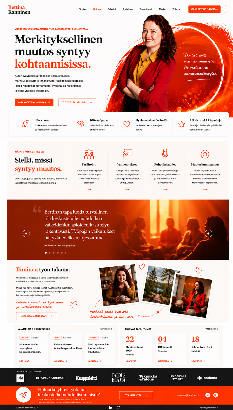
I wanted the site’s concept to feel modern, vibrant, and genuinely inspiring—a space that is clean and effortless to browse, yet full of color.
The hero section was the most iterative part of the process. I eventually landed on an abstract, flashy oil painting aesthetic, combined with layered, stylish personal imagery. To ground the visuals, I decided to apply a warm orange filter to all professional shots, while giving the more personal photos a touch of Polaroid-style nostalgia; this creates a sense of approachability and warmth throughout the site.
Finally, I chose organic typography to tie everything together. These fonts add a necessary layer of personality and spontaneity, ensuring the site feels human-made rather than just another sterile, corporate interface.